
A Hearty Welcome to You!
I am so thrilled to welcome you to the absolutely awesome world of data science. It is an interesting subject, sometimes difficult, sometimes a struggle but always hugely rewarding at the end of your work. While data science is not as tough as, say, quantum mechanics, it is not high-school algebra either.
It requires knowledge of Statistics, some Mathematics (Linear Algebra, Multivariable Calculus, Vector Algebra, and of course Discrete Mathematics), Operations Research (Linear and Non-Linear Optimization and some more topics including Markov Processes), Python, R, Tableau, and basic analytical and logical programming skills.
.Now if you are new to data science, that last sentence might seem more like pure Greek than simple plain English. Don’t worry about it. If you are studying the Data Science course at Dimensionless Technologies, you are in the right place. This course covers the practical working knowledge of all the topics, given above, distilled and extracted into a beginner-friendly form by the talented course material preparation team.
This course has turned ordinary people into skilled data scientists and landed them with excellent placement as a result of the course, so, my basic message is, don’t worry. You are in the right place and with the right people at the right time.
What is Data Science?

To quote Wikipedia:
Data science is a multi-disciplinary field that uses scientific methods, processes, algorithms, and systems to extract knowledge and insights from structured and unstructured data. Data science is the same concept as data mining and big data: “use the most powerful hardware, the most powerful programming systems, and the most efficient algorithms to solve problems.”
From Source
More Greek again, you might say.
Hence my definition:
Data Science is the art of extracting critical knowledge from raw data that provides significant increases in profits for your organization.
We are surrounded by data (Google ‘data deluge’ and you’ll see what I mean). More data has been created in the last two years that in the last 5,000 years of human existence.
The companies that use all this data to gain insights into their business and optimize their processing power will come out on top with the maximum profits in their market.
Companies like Facebook, Amazon, Microsoft, Google, and Apple (FAMGA), and every serious IT enterprise have realized this fact.
Hence the demand for talented data scientists.
I have much more to share with you on this topic, but to keep this article short, I’ll just share the links below which you can go through in your free time (everyone’s time is valuable because it is a strictly finite resource):
You can refer to:

and an excellent introductory article below.
An Introduction to Data Science:
Article Organization

Now as I was planning this article a number of ideas came to my mind. I thought I could do a textbook-like reference to the field, with Python examples.
But then I realized that true competence in data science doesn’t come when you read an article.
True competence in data science begins when you take the programming concepts you have learned, type them into a computer, and run it on your machine.
And then; of course, modify it, play with it, experiment, run single lines by themselves, see for yourselves how Python and R work.
That is how you fall in love with coding in data science.
At least, that’s how I fell in love with simple C coding. Back in my UG in 2003. And then C++. And then Java. And then .NET. And then SQL and Oracle. And then… And then… And then… And so on.
If you want to know, I first started working in back-propagation neural networks in the year 2006. Long before the concept of data science came along! Back then, we called it artificial intelligence and soft computing. And my final-year project was coded by hand in Java.
Having come so far, what have I learned?
That it’s a vast massive uncharted ocean out there.
The more you learn, the more you know, the more you become aware of how little you know and how vast the ocean is.
But we digress!
To get back to my point –
My final decision was to construct a beginner project, explain it inside out, and give you source code that you can experiment with, play with, enjoy running, and modify here and there referring to the documentation and seeing what everything in the code actually does.
Kaggle – Your Home For Data Science

If you are in the data science field, this site should be on your browser bookmark bar. Even in multiple folders, if you have them.
Kaggle is the go-to site for every serious machine learning practitioner. They hold competitions in data science (which have a massive participation), have fantastic tutorials for beginners, and free source code open-sourced under the Apache license (See this link for more on the Apache open source software license – don’t skip reading this, because as a data scientist this is something about software products that you must know).
As I was browsing this site the other day, a kernel that was attracting a lot of attention and upvotes caught my eye.
This kernel is by a professional data scientist by the name of Fatma Kurçun from Istanbul (the funny-looking ç symbol is called c with cedilla and is pronounced with an s sound).
It was quickly clear why it was so popular. It was well-written, had excellent visualizations, and a clear logical train of thought. Her professionalism at her art is obvious.
Since it is an open source Apache license released software, I have modified her code quite a lot (diff tool gives over 100 changes performed) to come up with the following Python classification example.
But before we dive into that, we need to know what a data science project entails and what classification means.
Let’s explore that next.
Classification and Data Science
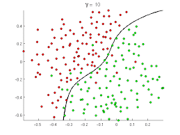
So supervised classification basically means mapping data values to a category defined in advance. In the image above, we have a set of customers who have certain data values (records). So one dot above corresponds with one customer with around 10-20 odd fields.
Now, how do we ascertain whether a customer is likely to default on a loan, and which customer is likely to be a non-defaulter? This is an incredibly important question in the finance field! You can understand the word, “classification”, here. We classify a customer into a defaulter (red dot) class (category) and a non-defaulter (green dot) class.
This problem is not solvable by standard methods. You cannot create and analyze a closed-form solution to this problem with classical methods. But – with data science – we can approximate the function that captures or models this problem, and give a solution with an accuracy range of 90-95%. Quite remarkable!
Now, again we can have a blog article on classification alone, but to keep this article short, I’ll refer you to the following excellent articles as references:
Steps involved in a Data Science Project
A data science project is typically composed of the following components:
- Defining the Problem
- Collecting Data from Sources
- Data Preprocessing
- Feature Engineering
- Algorithm Selection
- Hyperparameter Tuning
- Repeat steps 4–6 until error levels are low enough.
- Data Visualization
- Interpretation of Results
If I were to explain each of these terms – which I could – but for the sake of brevity – I can ask you to refer to the following articles:
and:
Steps to perform data science with Python- Medium
At some time in your machine learning career, you will need to go through the article above to understand what a machine learning project entails (the bread-and-butter of every data scientist).
Jupyter Notebooks

To run the exercises in this section, we use a Jupyter notebook. Jupyter is short for Julia, Python, and R. This environment uses kernels of any of these languages and has an interactive format. It is commonly used by data science professionals and is also good for collaboration and for sharing work.
To know more about Jupyter notebooks, I can suggest the following article (read when you are curious or have the time):
Data Science Libraries in Python

The standard data science stack for Python has the scikit-learn Python library as a basic lowest-level foundation.
The scikit-learn python library is the standard library in Python most commonly used in data science. Along with the libraries numpy, pandas, matplotlib, and sometimes seaborn as well this toolset is known as the standard Python data science stack. To know more about data science, I can direct you to the documentation for scikit-learn – which is excellent. The text is lucid, clear, and every file contains a working live example as source code. Refer to the following links for more:
This last link is like a bible for machine learning in Python. And yes, it belongs on your browser bookmarks bar. Reading and applying these concepts and running and modifying the source code can help you go a long way towards becoming a data scientist.
And, for the source of our purpose
Our Problem Definition
This is the classification standard data science beginner problem that we will consider. To quote Kaggle.com:
The sinking of the RMS Titanic is one of the most infamous shipwrecks in history. On April 15, 1912, during her maiden voyage, the Titanic sank after colliding with an iceberg, killing 1502 out of 2224 passengers and crew. This sensational tragedy shocked the international community and led to better safety regulations for ships.
One of the reasons that the shipwreck led to such loss of life was that there were not enough lifeboats for the passengers and crew. Although there was some element of luck involved in surviving the sinking, some groups of people were more likely to survive than others, such as women, children, and the upper-class.
In this challenge, we ask you to complete the analysis of what sorts of people were likely to survive. In particular, we ask you to apply the tools of machine learning to predict which passengers survived the tragedy.
From: Kaggle
We’ll be trying to predict a person’s category as a binary classification problem – survived or died after the Titanic sank.
So now, we go through the popular source code, explaining every step.
Import Libraries
These lines given below:
import pandas as pd
import numpy as np
import matplotlib.pyplot as plt;
import seaborn as sns
%matplotlib inline
Are standard for nearly every Python data stack problem. Pandas refers to the data frame manipulation library. NumPy is a vectorized implementation of Python matrix manipulation operations that are optimized to run at high speed. Matplotlib is a visualization library typically used in this context. Seaborn is another visualization library, at a little higher level of abstraction than matplotlib.
The Problem Data Set
We read the CSV file:
train = pd.read_csv('../input/train.csv')
Exploratory Data Analysis
Now, if you’ve gone through the links given in the heading ‘Steps involved in Data Science Projects’ section, you’ll know that real-world data is messy, has missing values, and is often in need of normalization to adjust for the needs of our different scikit-learn algorithms. This CSV file is no different, as we see below:
Missing Data
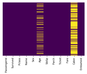
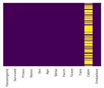
This line uses seaborn to create a heatmap of our data set which shows the missing values:
sns.heatmap(train.isnull(),yticklabels=False,cbar=False,cmap='viridis')
Output:
<matplotlib.axes._subplots.AxesSubplot at 0x7f3b5ed98ef0>
Interpretation
The yellow bars indicate missing data. From the figure, we can see that a fifth of the Age data is missing. And the Cabin column has so many missing values that we should drop it.
Graphing the Survived vs. the Deceased in the Titanic shipwreck:
sns.set_style('whitegrid')
sns.countplot(x='Survived',data=train,palette='RdBu_r')
Output:
<matplotlib.axes._subplots.AxesSubplot at 0x7f3b54fe2390>
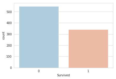
As we can see, in our sample of the total data, more than 500 people lost their lives, and less than 350 people survived (in the sample of the data contained in train.csv).
When we graph Gender Ratio, this is the result.
sns.set_style('whitegrid')
sns.countplot(x='Survived',hue='Sex',data=train,palette='RdBu_r')
Output
<matplotlib.axes._subplots.AxesSubplot at 0x7f3b54f49da0>
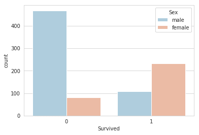
Over 400 men died, and around 100 survived. For women, less than a hundred died, and around 230 odd survived. Clearly, there is an imbalance here, as we expect.
Data Cleaning
The missing age data can be easily filled with the average of the age values of an arbitrary category of the dataset. This has to be done since the classification algorithm cannot handle missing values and will be error-ridden if the data values are not error-free.
plt.figure(figsize=(12, 7))
sns.boxplot(x='Pclass',y='Age',data=train,palette='winter')
Output
<matplotlib.axes._subplots.AxesSubplot at 0x7f3b54d132e8>
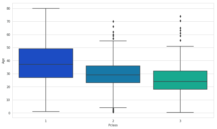
We use these average values to impute the missing values (impute – a fancy word for filling in missing data values with values that allow the algorithm to run without affecting or changing its performance).
def impute_age(cols):
Age = cols[0]
Pclass = cols[1]
if pd.isnull(Age):
if Pclass == 1:
return 37
elif Pclass == 2:
return 29
else:
return 24
else:
return Age
train['Age'] = train[['Age','Pclass']].apply(impute_age,axis=1)
Missing values heatmap:
sns.heatmap(train.isnull(),yticklabels=False,cbar=False,cmap='viridis')
Output:
<matplotlib.axes._subplots.AxesSubplot at 0x7f3b54a0d0b8>
We drop the Cabin column since its mostly empty.
train.drop('Cabin',axis=1,inplace=True)
Convert categorical features like Sex and Name to dummy variables using pandas so that the algorithm runs properly (it requires data to be numeric)..
train.info()
Output:
<class 'pandas.core.frame.DataFrame'> Int64
Index: 889 entries, 0 to 890
Data columns (total 11 columns):

PassengerId 889 non-null int64
Survived 889 non-null int64
Pclass 889 non-null int64
Name 889 non-null object
Sex 889 non-null object
Age 889 non-null float64
SibSp 889 non-null int64
Parch 889 non-null int64
Ticket 889 non-null object
Fare 889 non-null float64
Embarked 889 non-null object

dtypes: float64(2), int64(5), object(4)
memory usage: 83.3+ KB
More Data Preprocessing
We use one-hot encoding to convert the categorical attributes to numerical equivalents. One-hot encoding is yet another data preprocessing method that has various forms. For more information on it, see the link
sex = pd.get_dummies(train['Sex'],drop_first=True)
embark = pd.get_dummies(train['Embarked'],drop_first=True)
train.drop(['Embarked','Name','Ticket'],axis=1,inplace=True)
train = pd.concat([train,sex,embark],axis=1)
Finally, we check the heatmap of features again:
sns.heatmap(train.isnull(),yticklabels=False,cbar=False,cmap='viridis')
Output
<matplotlib.axes._subplots.AxesSubplot at 0x7f3b54743ac8>
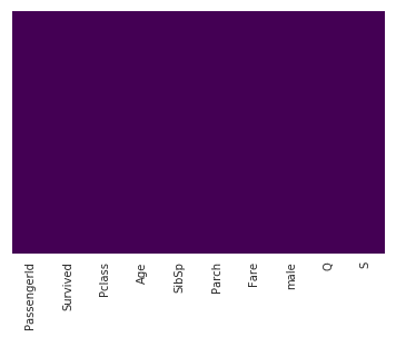
No missing data and all text converted accurately to a numeric representation means that we can now build our classification model.
Building a Gradient Boosted Classifier model
Gradient Boosted Classification Trees are a type of ensemble model that has consistently accurate performance over many dataset distributions.
I could write another blog article on how they work but for brevity, I’ll just provide the link here and link 2 here:
We split our data into a training set and test set.
from sklearn.model_selection import train_test_split

X_train, X_test, y_train, y_test = train_test_split(train.drop('Survived',axis=1), train['Survived'], test_size=0.10, random_state=0)
Training:
from sklearn.ensemble import GradientBoostingClassifier
model = GradientBoostingClassifier()
model.fit(X_train,y_train)
Output:
GradientBoostingClassifier(
criterion='friedman_mse', init=None, learning_rate=0.1, loss='deviance', max_depth=3, max_features=None, max_leaf_nodes=None, min_impurity_decrease=0.0, min_impurity_split=None, min_samples_leaf=1, min_samples_split=2, min_weight_fraction_leaf=0.0, n_estimators=100, n_iter_no_change=None, presort='auto', random_state=None, subsample=1.0, tol=0.0001, validation_fraction=0.1, verbose=0, warm_start=False)
Predicting:
predictions = model.predict(X_test)

predictions
Output
array([0, 0, 1, 1, 0, 0, 1, 0, 0, 1, 1, 1, 0, 1, 0, 0, 1, 1, 0, 0, 0, 0,
0, 0, 0, 1, 0, 1, 0, 0, 0, 0, 0, 0, 0, 0, 1, 0, 0, 0, 1, 0, 0, 1,
0, 0, 1, 1, 1, 0, 0, 1, 0, 0, 0, 0, 0, 0, 0, 1, 1, 1, 1, 0, 1, 0,
0, 1, 0, 0, 1, 0, 1, 1, 0, 1, 0, 0, 0, 0, 0, 1, 1, 0, 0, 1, 0, 1, 0])
Performance
The performance of a classifier can be determined by a number of ways. Again, to keep this article short, I’ll link to the pages that explain the confusion matrix and the classification report function of scikit-learn and of general classification in data science:
Confusion Matrix
A wonderful article by one of our most talented writers. Skip to the section on the confusion matrix and classification accuracy to understand what the numbers below mean.
For a more concise, mathematical and formulaic description, read here
from sklearn.metrics import classification_report,confusion_matrix

print(confusion_matrix(y_test,predictions))
[[89 16]
 [29 44]]
So as not make this article too disjointed, let me explain at least the confusion matrix to you.
The confusion matrix has the following form:
[[ TP FP ]
[ FN TN ]]
The abbreviations mean:
TP – True Positive – The model correctly classified this person as deceased.
FP – False Positive – The model incorrectly classified this person as deceased.
FN – False Negative – The model incorrectly classified this person as a survivor
TN – True Negative – The model correctly classified this person as a survivor.
So, in this model published on Kaggle, there were:
89 True Positives
16 False Positives
29 False Negatives
44 True Negatives
Classification Report
You can refer to the link here
-to learn everything you need to know about the classification report.
print(classification_report(y_test,predictions))
               precision   recall   f1-score  support
           0     0.75       0.85      0.80      105
           1     0.73       0.60      0.66       73
   micro avg     0.75       0.75      0.75      178
   macro avg     0.74       0.73      0.73      178
weighted avg     0.75       0.75      0.74      178
So the model, when used with Gradient Boosted Classification Decision Trees, has a precision of 75% (the original used Logistic Regression).
Wrap-Up
I have attached the dataset and the Python program to this document, you can download it by clicking on these links. Run it, play with it, manipulate the code, view the scikit-learn documentation. As a starting point, you should at least:
- Use other algorithms (say LogisticRegression / RandomForestClassifier a the very least)
- Refer the following link for classifiers to use:
Sections 1.1 onwards – every algorithm that has a ‘Classifier’ ending in its name can be used – that’s almost 30-50 odd models! - Try to compare performances of different algorithms
- Try to combine the performance comparison into one single program, but keep it modular.
- Make a list of the names of the classifiers you wish to use, apply them all and tabulate the results. Refer to the following link:
- Use XGBoost instead of Gradient Boosting
Titanic Training Dataset (here used for training and testing):
Address of my GitHub Public Repo with the Notebook and code used in this article:
Clone with Git (use TortoiseGit for simplicity rather than the command-line) and enjoy.
To use Git, take the help of a software engineer or developer who has worked with it before. I’ll try to cover the relevance of Git for data science in a future article.
But for now, refer to the following article here
You can install Git from Git-SCM and TortoiseGit
To clone,
- Install Git and TortoiseGit (the latter only if necessary)
- Open the command line with Run… cmd.exe
- Create an empty directory.
- Copy paste the following string into the command prompt and watch the magic after pressing Enter: “git clone https://github.com/thomascherickal/datasciencewithpython-article-src.git” without the double quotes, of course.
Use Anaconda (a common data science development environment with Python,, R, Jupyter, and much more) for best results.
Cheers! All the best into your wonderful new adventure of beginning and exploring data science!

Follow this link, if you are looking to learn data science online!
You can follow this link for our Big Data course, which is a step further into advanced data analysis and processing!
Additionally, if you are having an interest in learning Data Science, click here to start the Online Data Science Course
Furthermore, if you want to read more about data science, read our Data Science Blogs
Trackbacks/Pingbacks