Introduction
Evaluation metrics have a correlation with machine learning tasks. The tasks of classification, regression, ranking, clustering, topic modelling, etc, all have different metrics. Some metrics, such as precision, recall, are of use for multiple tasks. Classification, regression, and ranking are examples of supervised learning, which comprises a majority of machine learning applications. In this blog, we’ll be focusing on the metrics for supervised learning modules.
What is the Model Evaluation?
Evaluating a model is a very important step throughout the development of the model. Some methods such as the ANN model do the evaluation when it performs backpropagation. However, we still perform the evaluation of a model manually through various methods. It is important to note that we can evaluate models successfully. Especially, when working in a supervised learning environment as the actual values are available. These values help in order for the evaluation methods to function.
The models under supervised learning fall broadly under two categories- Regression problems and Classification problems. Also, the methods of evaluating these models also fall under such two categories only. Additionally, they are the evaluation of regression Models and evaluation of classification problems.
There is a fundamental difference between the methods for evaluating a regression and classification model.
With regression, we deal with continuous values where one can identify the error between the actual and prediction output.
However, when evaluating a classification model, the focus is on the number of predictions that we can classify correctly. Also to evaluate a classification model correctly, we also have to consider the data points that we classify incorrectly. Also, we deal with two types of classification models. There are some of which produce class output such as KNN and SVM. Furthermore, these are ones whose output is simply the class label. Others are probability producing models such as Logistic Regression, Random Forest etc. Also, their output is the probability of a data point belonging to a particular class. Also, through the use of a cut off value, we are able to convert these probabilities into class labels. Then we can end up classifying the data points.
Model Evaluation Techniques
Model Evaluation is an integral part of the model development process. It helps to find the best model that represents our data. It also focusses on how well the chosen model will work in the future. Evaluating model performance with the training data is not acceptable in data science. It can easily generate overoptimistically and overfit models. There are two methods of evaluating models in data science, Hold-Out and Cross-Validation. To avoid overfitting, both methods use a test set (not seen by the model) to evaluate model performance.
Hold-Out
In this method, the mostly large dataset is randomly divided into three subsets:
- The training set is a subset of the dataset to build predictive models.
- The validation set is a subset of the dataset to assess the performance of the model built in the training phase. It provides a test platform for fine-tuning model’s parameters and selecting the best-performing model. Not all modelling algorithms need a validation set.
- Test set or unseen examples is a subset of the dataset to assess the likely future performance of a model. If a model fit to the training set much better than it fits the test set, overfitting is probably the cause.
Cross-Validation
When only a limited amount of data is available, to achieve an unbias estimate of the model performance we use k-fold cross-validation. In the k-fold cross-validation, we divide the data into k subsets of equal size. We build models times, each time leaving out one of the subsets from training and use it as the test set. If k equals the sample size, this is a “leave-one-out” method.
Regression Model Evaluation Methods
After building a number of different regression models, there is a wealth of criteria by which we can evaluate and compare them
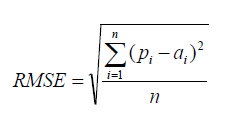
Root Mean Square Error
RMSE is a popular formula to measure the error rate of a regression model. However, we can only compare between models whose errors we can measure in the same units
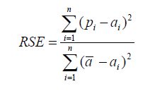
Relative Square Error
Unlike RMSE, the relative squared error (RSE) can be compared between models whose errors we can measure in different units
Mean Absolute Error
Mean Absolute Error is the average of the difference between the Original Values and the Predicted Values. It gives us the measure of how far the predictions were from the actual output. However, they don’t give us any idea of the direction of the error i.e. whether we are under predicting the data or over predicting the data. Mathematically, it is represented as :

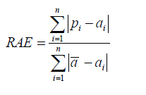
Relative Absolute Error
Like RSE, the relative absolute error (RAE) can be compared between models whose errors are measured in the different units.
Coefficient of Determination
The coefficient of determin
ation (R2) summarizes the explanatory power of the regression model and is computed from the sums-of-squares terms.
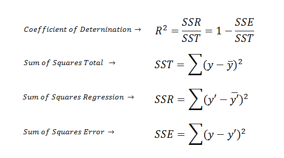
R2 describes the proportion of variance of the dependent variable explained by the regression model. If the regression model is “perfect”, SSE is zero, and R2 is 1. If the regression model is a total failure, SSE is equal to SST, no variance is explained by regression, and R2 is zero.
Standardized Residuals (Errors) Plot
The standardized residual plot is a useful visualization tool in order to show the residual dispersion patterns on a standardized scale. There are no substantial differences between the pattern for a standardized residual plot and the pattern in the regular residual plot. The only difference is the standardized scale on the y-axis which allows us to easily detect potential outliers.
Classification Model Evaluation Methods
Confusion Matrix
A confusion matrix shows the number of correct and incorrect predictions made by the classification model compared to the actual outcomes (target value) in the data. The matrix is NxN, where N is the number of target values (classes). Performance of such models is commonly evaluated using the data in the matrix. The following table displays a 2×2 confusion matrix for two classes (Positive and Negative).

- Accuracy: the proportion of the total number of predictions that were correct.
- Positive Predictive Value or Precision: the proportion of positive cases that were correctly identified.
- Negative Predictive Value: the proportion of negative cases that were correctly identified.
- Sensitivity or Recall: the proportion of actual positive cases which are correctly identified.
- Specificity: the proportion of actual negative cases which are correctly identified.

Gain and Lift Charts
Gain or lift is a measure of the effectiveness of a classification model calculated as the ratio between the results obtained with and without the model. These charts are visual aids for evaluating the performance of classification models. However, in contrast to the confusion matrix that evaluates models on the whole population gain or lifts chart evaluates model performance in a portion of the population.
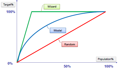
Example:
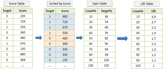
Gain Chart
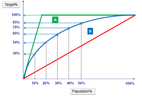
Lift Chart
The lift chart shows how much more likely we are to receive positive responses than if we contact a random sample of customers. For example, by contacting only 10% of customers by our predictive model we will reach 3 times as many respondents as if we use no model.
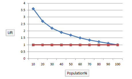
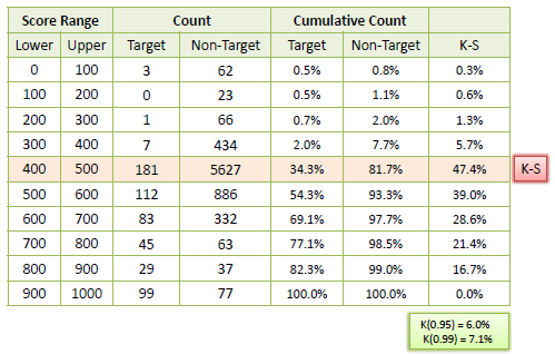
K-S Chart
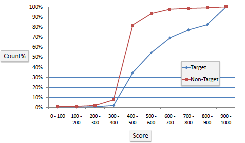
K-S or Kolmogorov-Smirnov chart measures the performance of classification models. More accurately, K-S is a measure of the degree of separation between positive and negative distributions. The K-S is 100 if the scores partition the population into two separate groups in which one group contains all the positives and the other all the negatives. On the other hand, If the model cannot differentiate between positives and negatives, then it is as if the model selects cases randomly from the population. The K-S would be 0. In most classification models the K-S will fall between 0 and 100, and that the higher the value the better the model is at separating the positive from negative cases.
Example: The following example shows the results from a classification model. The model assigns a score between 0–1000 to each positive (Target) and negative (Non-Target) outcome.
ROC Chart
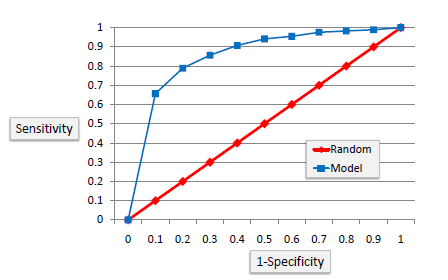
The ROC chart is similar to the gain or lifts charts in that they provide a means of comparison between classification models. Also, the ROC chart shows false positive rate (1-specificity) on X-axis, the probability of target=1 when its true value is 0, against true positive rate (sensitivity) on Y-axis, the probability of target=1 when its true value is 1. Ideally, the curve will climb quickly toward the top-left meaning the model has correct predictions. Furthermore, the diagonal red line is for a random model.
Area Under the Curve (AUC)
The area under the ROC curve is often a measure of the quality of the classification models. A random classifier has an area under the curve of 0.5, while AUC for a perfect classifier is equal to 1. In practice, most of the classification models have an AUC between 0.5 and 1.
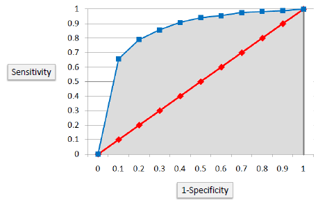
An area under the ROC curve of 0.8, for example, means that a randomly selected case from the group with the target equals 1 has a score larger than that for a randomly chosen case from the group with the target equals 0 in 80% of the time. Furthermore, when a classifier cannot distinguish between the two groups, the area will be equal to 0.5 ( will coincide with the diagonal). Also, when there is a perfect separation of the two groups, i.e., no overlapping of the distributions, the area under the ROC curve reaches to 1 (the ROC curve will reach the upper left corner of the plot).
Follow this link, if you are looking to learn more about data science online!
You can follow this link for our Big Data course!
Additionally, if you have interest in learning Data Science, click here to start your career
Furthermore, if you want to read more about data science, you can read our blogs here
Also, the following are some great blogs you may like to read

